


Are you hungry for delicious BBQ from around the world?
Project
My Role
Duration
Conceptual web design for a full BBQ prep-and-deliver service
Strategy, Information Architecture, Responsive Web design, Branding
3 weeks
STRATEGY
WIREFRAMING
INFORMATION
ARCHITECTURE
PROTOTYPING AND USABILTY TESTING
FINAL VISUAL DESIGN

POSITIONING
MEATUP BBQ
A World of BBQ
MeatUp BBQ is a BBQ prep-and-deliver service that makes life easy for busy working people in south Silicon Valley. We provide the widest variety of authentic BBQ: from the Southern US, Hawaii, Japan, Korea, Hong Kong, and others upon request. All of it highest quality and affordable.

TARGETING
-
People who want flavorful food
-
People who like to try new foods
-
People who want a total "comfort" meal easy solution
Demographics:
Gender – Aimed more at men than women
Education – College educated
Occupations – White collar, working in tech companies, middle or higher level blue collar
Age – 25 to 50 years old
Marital status – Single or Married
Income – Annual US$80,000+
Location – Silicon Valley and environs

USER AND COMPANY NEEDS
What the user needs:
-
Find out if the restaurant can deliver to their location
-
Find out the service hours
-
Customize and order food online easily
-
Provide clear and attractive photos of the menu items
-
Provide a secure payment system
-
Print or save receipt
-
Tracking the order after it has been placed
What the company needs:
-
Provide a user-friendly system which works clearly and easily via desktop and mobile device
-
Provide an easy ordering system for order customization
-
Provide a secure payment system
-
Provide a system for customer to track their order
-
Communicate offering international BBQ varieties
-
Communicate the use of high-quality food ingredients
-
A dedicated area of homepage that client can easily update themselves for the latest promotional offers
-
A back-end system to gather customers' information for CRM program
INFORMATION ARCHITECTURE
Content Requirements
Restaurant general information
- About us
- Phone number
- Address
Promotion information
- Photos
- Videos
Menu
- Food & beverage selections
- Photos
- Price
- Food allergy warning
FAQ
- Is there a minimum-cost order?
- Where do you deliver?
- May I schedule my order?
- Can I pay cash instead?
- How do you make sure the food is still hot when delivered?
- From where are the ingredients sourced?
Functionality Requirements
Register / login
- Phone number
- Password
- Password recovery
Customize order from the Menu
- Main
- Side
- Drink
Check-out
- shopping cart
(add / delete / confirm order)
- payment options
(Debit card / Credit Card / PayPal)
Confirmation email/text
- Receipt
- tracking link
Tracking the order after it has been placed
- Show the delivery scooter's location in a live map
Based on the insights gained from the initial content audits and competitor analyses, I defined the sitemap for Meatup BBQ and evaluated the intuitive arrangement of topics within the website via tree test with potential users.


The "Tree" was set up according to the sitemap. As the website is structurally simple, I decided to use three crucial questions with nine users for the test, and then I sent out the test to users who are from Hong Kong, Germany, and the US, since my target audience is people from various cultures.
TREE ANALYSIS
Task 1: How do I select what to eat?
Correct answer:
MENU > Entrée > Add to cart
MENU > Sides > Add to cart
MENU > Drinks > Add to cart


Task 2: Where can I find the restaurant's hours of operation?
Correct answer:
ABOUT US > Our service


Task 3: How can I find out if the restaurant delivers to my area?
Correct answer:
ABOUT US > Our service
The Tree analysis showed that all users (100%) were quickly able to complete the 1st task "How do I select what to eat?". However, for tasks 2 and 3 "Where can I find the restaurant's hours of operation?" and "How can I find out if the restaurant delivers to my area?", the completion rate was 56% and 44% respectively. This proved the information architecture needed further restructuring to get the user to the information they need more directly.

FINAL SITEMAP
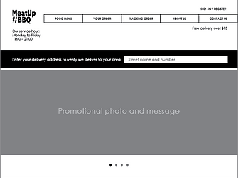
Following the results from the analysis of the sitemap, some things were adjusted. The "opening hours" and "delivery radius" moved to the homepage so that users easily see this information right after arriving at the website without any additional action required. Also, the sign-in process was modified to simplify the main menu.

WIREFRAMING


LOGO DESIGN

MeatUp BBQ is targeted at busy working people in south Silicon Valley who are mainly working in technology or international companies, so I chose a bold Sans-serif typeface for a contemporary image that says MeatUp BBQ serves food in bold flavors. Bright red-orange represents fire on the top, charcoal blue represents charcoal grilling at the bottom. The grilled meat graphic on the right easily recalls "Meat" and "BBQ". The hashtag gives added character to the logo while gaining currency with social media to increase the connection and desired bond with the target audiences.
DESIGN SYSTEM
Pattern Library
#Typography

#Color

#Icon
Style Guide
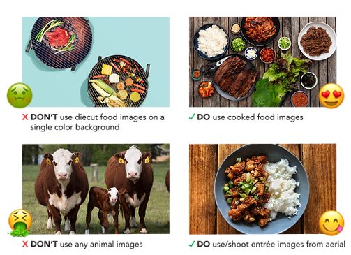
#Photography
#Button

VISUAL MOCKUP
I crafted three different designs for the website homepage. In the end, I decided to use the third approach as it has the best balance between functionality and attractive design.

1st layout

2nd layout
In this 3rd homepage design, I strategized a visual hierarchy using the text and graphic sizes, shapes, directions, and weights. This naturally leads the user to view the interface following my planned sequence.


PROTOTYPE AND TESTING
A clickable high-fidelity prototype version for desktop was created with InVision and sent to five people with the following questionnaire for feedback:
-
Look at the homepage in the prototype. Please number 1-5 which items your eyes were attracted to first, second, etc. in your viewing path after you arrived at the site.
O Logo O Headline O Main menu O Main visual O Delivery radius searching
-
How well do you rate the ease and quickness of the navigation?
If the answer you chose is not "Good" or "Excellent", please tell us why?
O Bad O Fair O Good O Excellent
-
Were you able to accomplish these tasks easily in this prototype?
Task 1: Complete the food ordering (from Entrée to order confirmation page)
Task 2: Try to navigate back and forth between different pages within the ordering process
-
Rate the intuitiveness of the interaction in the prototype. How easy was it for you to understand which of the elements in the prototype were meant to be clicked?
If the answer you chose is not "Good" or "Excellent", please tell us why?
O Bad O Fair O Good O Excellent
-
Are there any missing features? Areas that might confuse or overwhelm a user? Anything that seems out of place or unnecessary? Why?
Result:
Again, user tests revealed additional points of potential confusion in the structure of the user interface regarding certain user understandings and interactions. In addition, the users asked constructive questions which led to further improvements.
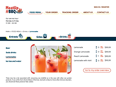
Overall users like the interface design but feel that the intuitiveness can be improved for navigating the food menu offerings. So I changed this navigation from two clicks within the same page to one click, after which the user gets a pop-up window that shows the second-tier menu specific to their selection. This action also enhances the user experience by creating more visible interaction:reward. Further, to simplify main menu navigation, "FOOD MENU" is changed to "MENU" and "YOUR ORDER" changed to "CART". "TRACKING ORDER" no longer appears in the site interface; users can only access this directly via the confirmation text/email. On the mobile version, after sign-in on the splash screen, the user directly enters the "Entrée menu".

FINAL VISUAL DESIGN
What have I learned?
Through the process of MeatUp BBQ website development, I clearly see that information architecture (IA) is crucial to the user experience. Even the most attractive website with compelling content and eye-catching UI design can fail without the right IA for the purpose. Disorganized content makes navigation difficult and vague, with users getting easily lost and then annoyed. Using the Tree test in the initial stage definitely helps for generating more direct and intuitive site flow, since it quickly discovers any chance of usability or navigation problems. It also increases work efficiency, lessening the chance of wasting time in the later development stages.